How data visualisation can help your business convey complex information
Whatever your industry, data will play a key role in delivering crucial insight into mission-critical factors that can help you achieve your business goals. Whether you’re looking at population density and local CO2 emissions or sales figures and open rates, it’s important that the data is presented in a way that is easy to understand for the user.
If you're scratching your head wondering what that means, let me break it down for you...
In its rawest form, data can be difficult to process. It could be a spreadsheet made up of thousands or rows of numbers, or a database with millions of entries. That’s where data visualisation comes in, and it’s about a lot more than just making something pretty. By selecting one or more key metrics and finding the most suitable way to visualise them, we find ourselves with a chart, graph, infographic or visual that tells a compelling story and delivers a clear message.
Data visualisation in sustainability marketing
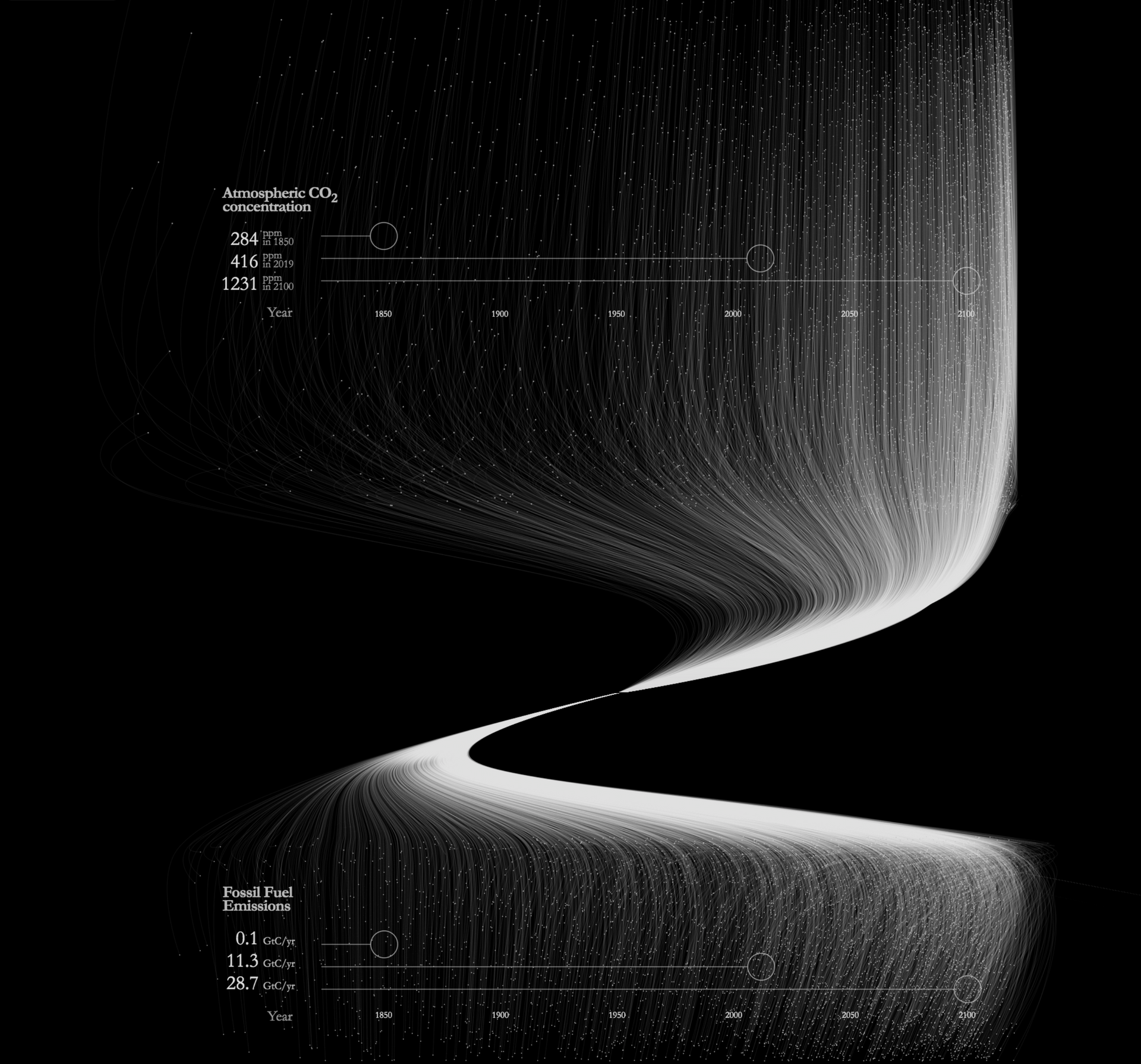
So, you’re a sustainable business and you have data to share with your customers or clients. Good, this is a great way to demonstrate your progress in a particular area or to illustrate the reality of a particular issue that you’re trying to tackle.
Arguably, the sustainability sector has it harder than others, with many naysayers and critics fighting against the science, so the more we can do to visualise the data that we rely on to tell our story, the better.
Whether you’re producing a physical product or delivering a digital service, your customers will be looking for proof and validation that what you’re doing actually works, because this is the world that we live in now.
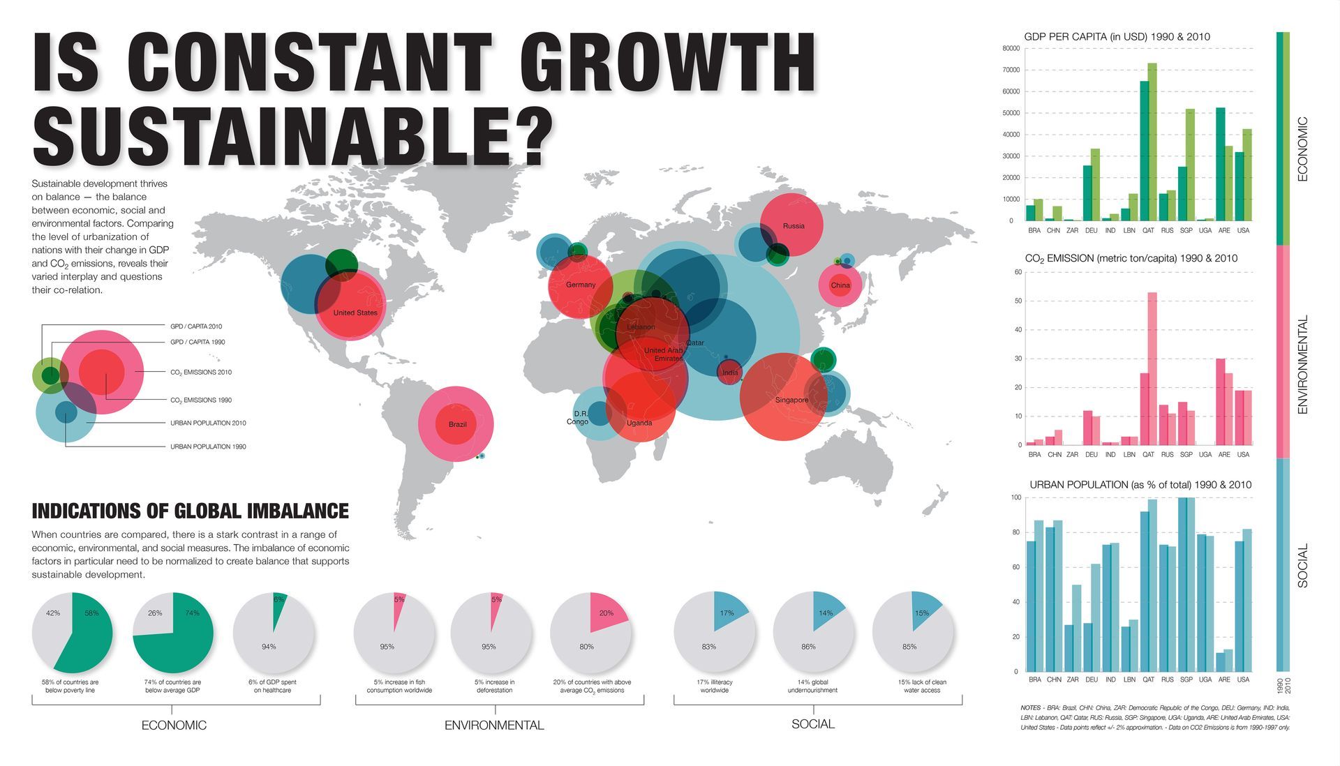
In most cases, it pays to start simple, with straightforward ‘x versus y’ comparisons. Not only is this data easy to collect, but it’s relatively easy to visualise too. An example of this might be the effect that your company’s product or service has on a customer, such as a before and after comparison. Or, you could choose to use data visualisation to demonstrate more complex areas like the improvement or deterioration of a metric over time, such as air quality or energy efficiency.
Here are some great examples of data visualisation in sustainability:
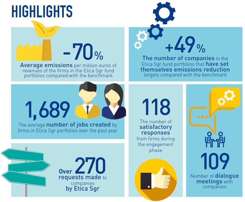
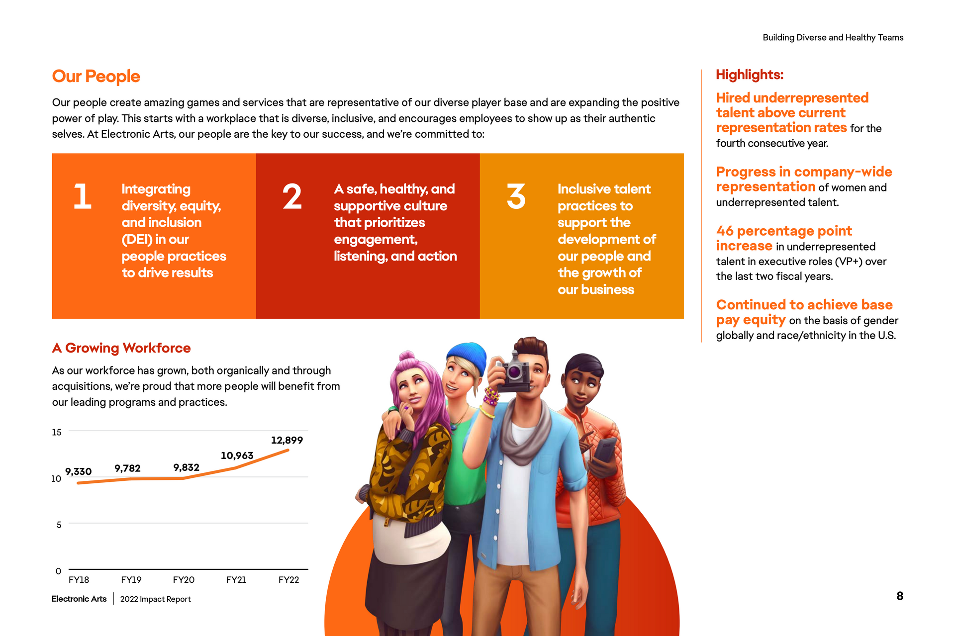
Data visualisation in impact reporting
Impact reporting is an essential part of becoming a sustainable business. It’s the proof that demonstrates the progress a business has made over a period of time, typically a year. You could be forgiven for thinking that impact reports are only necessary for B Corp-certified businesses. Whilst it is a requirement for B Corps, we firmly believe that any sustainable business should be producing an impact report – not only to understand their own carbon footprint and environment and social impact, but to make this data readily available to their audience.
Impact reports cover a business’ carbon emissions, their local and environmental impact and their social responsibility as an employer, which typically addresses diversity, pay gaps and so on. As you can imagine, an entire report full of this data could be a difficult read unless key metrics are extrapolated from the raw data and visualised in a way that can be easily digested.
Here are some recent examples of data visualisation for impact reporting:
Making data viz work for you
It’s not all weighty reports and serious stats. Data visualisation can also be an effective method for bringing visual interest and interaction to other areas of your organisation. Let’s take a look at some of the ways in which you can use data visualisation to tell a story.
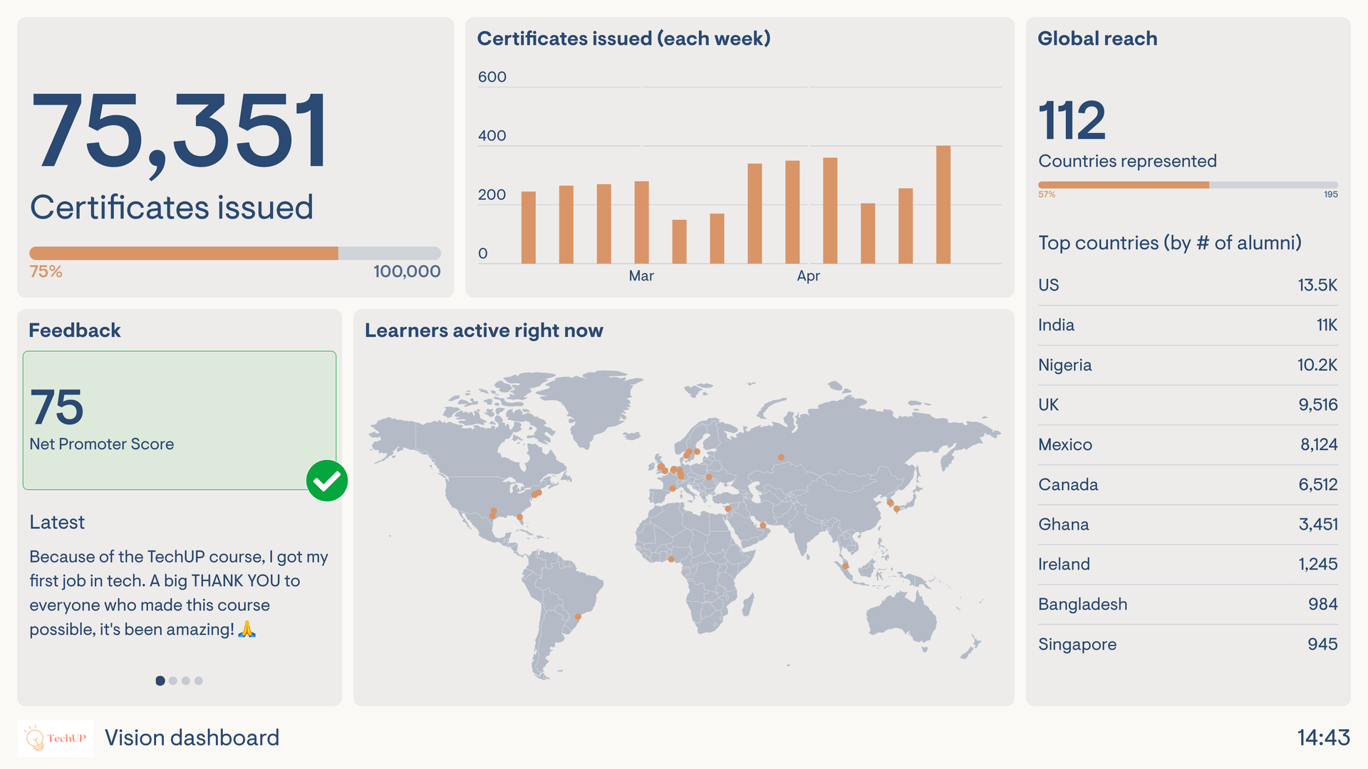
Dashboard creation
A digital dashboard is an effective way to bring together multiple data points into a single interface and provide a comprehensive overview of performance indicators. The beauty of a dashboard is its versatility. A capable design and development team can build a dashboard for just about any kind of business, from financial analysis to energy monitoring. A well-executed dashboard will enable data-driven decision making and help companies understand where and how they can make changes to achieve their goals.
Business intelligence
Data analysis is vital for businesses striving to get ahead in their sector. Visualisation can help organisations to understand sales trends, customer behaviour and market segments, as well as tapping into their own operational efficiency – helping to make informed decisions that improve overall business performance and bring a competitive advantage.
Predictive analytics
Being able to predict “what’s next” is a superpower for any business. With access to reliable data and the advent of powerful artificial intelligence, predictive analysis has seen a huge spike in recent years, with many businesses finding the ability to accurately look into the future and adjust their business strategy accordingly. Whether through graphs, heatmaps or virtual models, these types of visualisation can help stakeholders interpret and validate their own data and market data for better decision making.
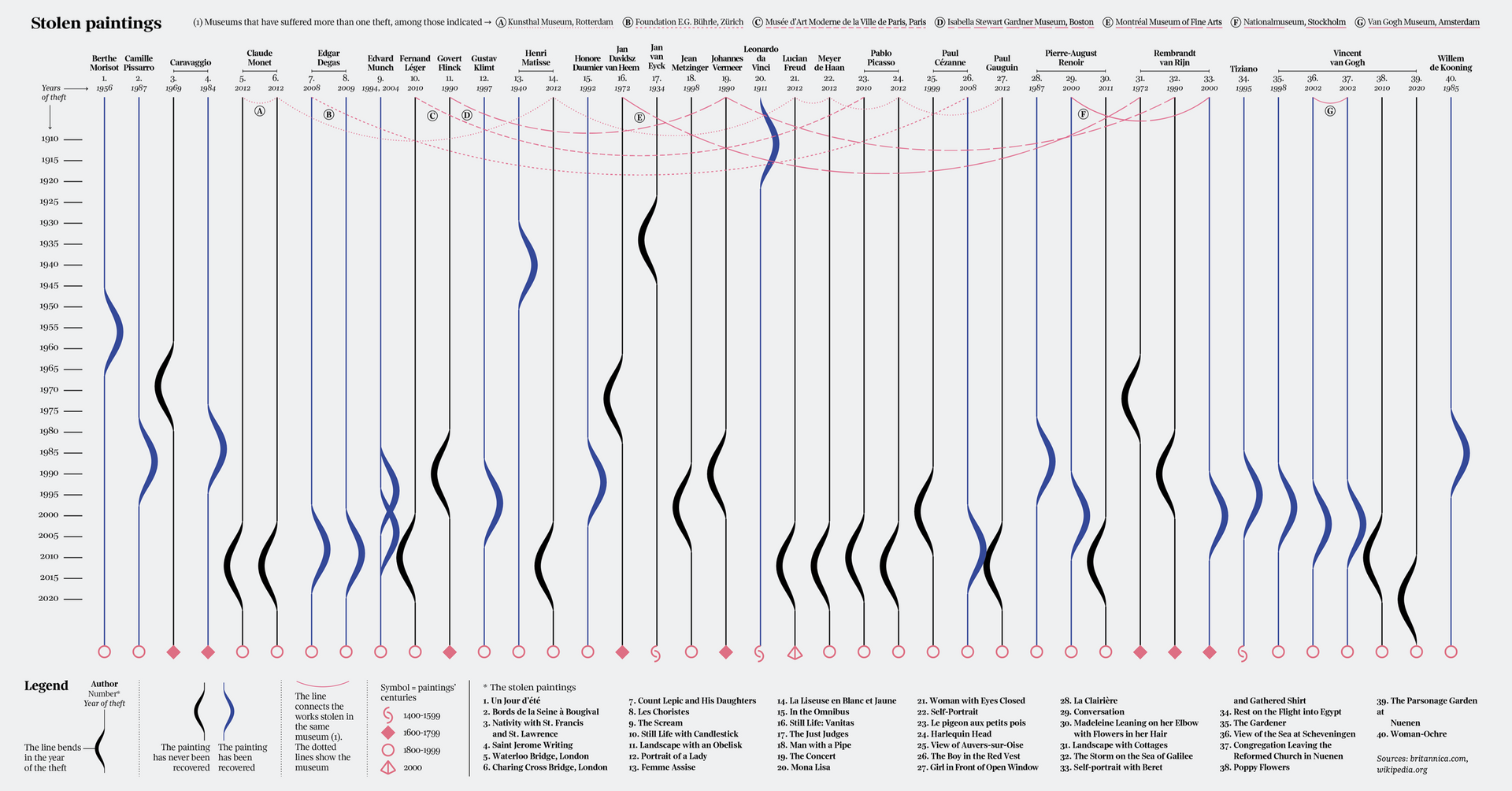
The power of design
Whilst auto-generated dashboards and free online tools are useful, you’ll often find yourself with an uninspiring collection of pie charts and line graphs that wouldn’t look out of place in Microsoft Excel. The real magic of data visualisation is in the design. We won’t go as far as saying it’s become a competitive sport in recent years, but some of the work we’ve seen is simply staggering.
As an agency with firm roots in creativity, we see the value in good design and go above and beyond to present our clients’ data in a way that not only delivers a key message, but sparks interest and wows the audience. Gone are the days of simple infographics and regimented charts. Instead, we are seeing beautiful line art, clever colourways and intricate layouts.
That said, it can be easy to get carried away. Our approach puts sustainability and accessibility first, ensuring that the audience can clearly understand that takeaway message, and don’t have any difficulty in interpreting the data. There’s certainly a balance between an interesting design and a simple message.
Let’s take a look at some examples of striking design in data visualisation:
We are the vision makers
We’ve worked with dozens of clients looking to bring their data to life in a unique and powerful way, from renewable energy consultants to sustainable real estate firms. Each and every brief is different, with organisations taking data from vastly different sources. But the story remains the same, and in fact, it’s quite a simple one too.
- How can we demonstrate sustainability?
- How can we show that the time to act is now?
- How can we capture and keep attention?
The answer to all three of these questions, in part, is to give us a call. If you’re a sustainability-focused business or a built environment firm and you’re looking to visualise data, build a dashboard or produce an impact report, you’re in the right place.
Get in touch with us today and find out how we can use data visualisation and design to tell your story.
Share the love